Your not going to believe this headline was published.

Spelling and grammar mistakes? We all make them.

When I say “we,” I’m of course referring to advertisers, bloggers, publishers and content creators. But I’m especially talking to the writers out there—you know, the people who first bring those little words to life.

Oops. We was not paying attention.

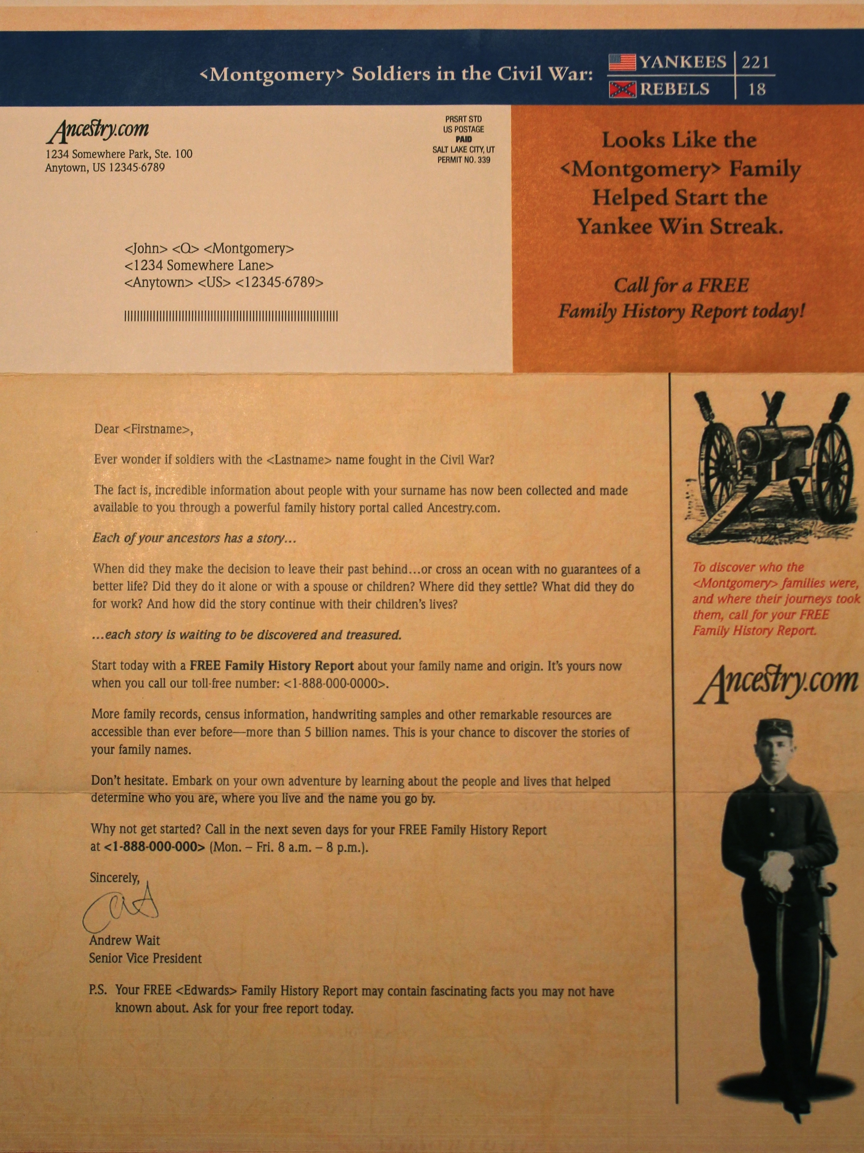
The problem is, we sometimes publish our mistakes for everyone to see. Hubspot pointed out the spelling mistake on the political campaign app above produced for Mitt Romney. Dozens of people must have seen this dyslexic spelling of America during the production process, but perhaps just not a proofreader.

The tweet below was posted in response to the creative spelling of America in the app. If you’re not looking closely, you can still completely miss the error purposely duplicated in the hashtag.

Remember to excercise good proofing habits.

Well then, let me admit one of my own mistakes. (Sigh.)

At one of the first agencies I worked for, we misspelled the word exercise in a fitness equipment catalog—for a fitness client no less—typing in the extra “c” that obviously doesn’t belong. I say “we,” because it’s not always the writer who makes the mistake.

In this case, the designer incorrectly typed the word exercise into a logo. The mistake was caught and the logo (which had seven color variations and appeared on almost every spread) was updated. But this is where mistakes can still come back to haunt you. You see, since the files had already been sent to a third-party vendor, new files were sent.

Adding to a series of unfortunate events, the vendor then attached the wrong (original) art files when they were collected and sent off to the printer. During the press check, another individual and myself missed several more last chances to remedy the error and the incorrect logo made its way onto thousands of printed catalogs.

The client was not happy.

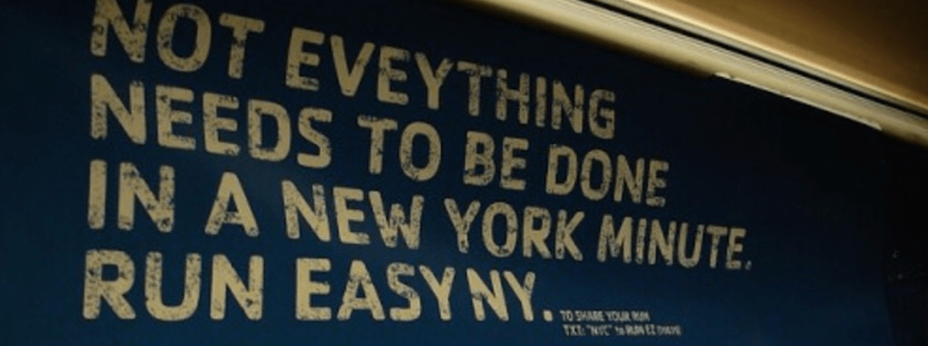
Quality checks are a part of eveything we do.

Here’s another example on a Reebok ad where everything is correct except “everything” (credit to bMedia for finding this one, and who rightfully suggests not trying to write copy in a New York minute).

Once a mistake makes it to press, it’s not just the embarrassment that must be lived down. The files need to be updated and put into production again, adding major costs that the client might not want to pay for. With digital work, fixing the problem may be less costly, but still takes time and added effort.

Lets weed out those mistakes...

What can you do to prevent errors from making it out the door, like missing apostrophes, for example? Start by implementing some of the following best practices:

  1. Run spellcheck every time you close a document. (Yes, every time.)
  2. Spellcheck doesn’t catch everything, so also proofread your work.
  3. Make sure you haven’t made common mistakes like mixing up your/you’re, there/their, it’s/its or losing/loosing.
  4. Ensure art directors and designers copy and paste content (instead of keying in copy directly).
  5. Create a workflow that ensures edits are approved by the right people (editor, proofreader, subject matter expert, etc.).
  6. Follow the workflow you’ve established.
  7. Version your documents, keeping track of changes made in each round of edits.

So yeah, we all make mistakes. Just make sure you catch them before it’s too late.

Shooting an agency Star Wars spoof on Utah’s Antelope Island.

Dave Thomas, TA’s CEO, plays the part of Luke Skywalker.

A Star Wars fan from my youth, I was elated to write and direct a short Star Wars spoof video. This five-minute production gave me my one chance to be George Lucas and fulfill one of my childhood fantasies.

The video was to be shown internally at a ThomasArts agency employee appreciation event. The part of Luke Skywalker was played by agency founder Dave Thomas, who with his silver-whiskered beard looked like he could definitely pass for the real Skywalker.

Medicare for everyone. Including Jedis.

Based on the final scene of Star Wars: The Force Awakens, our plot weaves in a few inside jokes for employees to pick up on. For starters, when Rey ascends the island peak and finally confronts Luke, she doesn’t hand him a light saber. She instead hands him a Medicare enrollment late notice rolled up in a scroll.

Turns out while he was in hiding, Luke missed the deadline for applying for his age-in enrollment into Medicare (an inside joke, since the agency does a lot of Medicare marketing for its healthcare clients).

Episode VIII: The Last Jingle?

As the conversation continues, Luke shares his aspirations for starting over and trying something new—like maybe going into advertising. This is also an inside story since Dave Thomas actually got his start in the advertising business by writing musical jingles.

His character then asks Rey if she wants to hear one of his jingles. The scene fades out from a drone shot with Rey walking away baffled as Luke stays behind eagerly belting out a few of his prized creative jingles.

Finding the right location.

Matching the scenery of the beautiful tropical island in the movie was not going to happen. Especially in the mostly desert state of Utah. But I did have one idea. Thinking of a place I had been to on Antelope Island, which is in the Great Salt Lake, I remembered that from the peak of Buffalo Point (yes, buffaloes really do roam the island) you can see water on both sides . This would allow us to somewhat capture the makeup of the real scene—although it’s not quite a lush, green paradise.

So I went on a drive to scout out the location and it was indeed perfect, though it was a short, yet steep hike to get to the top. But since we needed to shoot Rey making an uphill climb anyway, it worked out with our plans.

Our co-lead, Shona Kay Moyer (playing the part of Rey), and me on location at Antelope Island, The Great Salt Lake, Utah.

Star-struck fifth graders.

Our shoot happened to coincide with a small bus of schoolchildren who also hiked the peak. As they approached the top to see Luke Skywalker and Rey shooting a movie scene, a couple of the kids asked if this was a promo for the real Star Wars movie. Nope, sorry kids! But it’s always inspiring to see another generation of Star Wars fans!

It was a sunny but crisp October day for this agency shoot.
Our talent and crew: Chas Kelly (sound/editing), Dave Thomas (Luke), Bethany Cozad (props/gear), Shona Kay Moyer (Rey), and Rod Santiano (video/editing).

Microcopy. Small words tasked with big jobs.

Microcopy should never be an afterthought. Although just a few words strung together at important junctions of a website or app, they play a big role in the customer UX. But before talking about microcopy, it’s important to understand what microcopy is—and what it is not.

First things first. What is microcopy?

Bobbie Wood and Patrick Stafford do a great job of defining microcopy in UX writing versus microcopy, where they define the roles of content strategy, UX writing and microcopy. They identify UX writing as “the customer-facing communication at every point in a long customer journey, not just the bits of UI text that accompany components.”

Microcopy is therefore a subset of UX copy. It is the very specific copy (sometimes called UI text) associated with website, product or app components that come at key points of the user experience. Think of the overall content strategy and the broad UX writing as the roadmap and messaging that lead you to these critical decision points.

Microcopy has a job to do. Actually several.

You may be reading this post to answer the question, “What exactly is the job of good microcopy?” Glad you asked.

It’s not just one job. Microcopy tackles several important jobs, sometimes more than one at a time. In a Shopify blog on this topic, Microcopy: Why Tiny Words Matter, Nick Babich identifies five ways microcopy can improve the design or user experience. These include:

  • Alleviate the user’s concerns
  • Help users along the way
  • Set expectations
  • Bring delight
  • Boost engagement

As you can see, each of these tasks are important functions that good microcopy should accomplish. Each of these jobs help to promote a better user experience and propel the relationship forward.

This “how it works” microcopy from Dollar Shave Club not only helps set expectations, but also preps the user to make the next step.

Of these five types of microcopy, my personal bias is that Help users along the way is the most important function of microcopy. Why? Because this is the messaging that does things like tell the user how to get started or what to do next. Quite simply, it guides the user as to what actions they should take—and why.

Push the buffalo off the cliff.

Coming from a background of direct response copywriting, I appreciate how microcopy is sometimes a direct CTA, or call-to-action. You’re telling the reader what to do, why they should do it and helping them feel good about it. All in as few words as possible.

This microcopy, though brief, is a direct CTA that tells the user what to do next, a primary purpose of microcopy.

One of my first mentors, Peter Harrison (of the former agency Smith Harrison Direct), would always tell me to make sure to push the buffalo off the cliff. This of course means, don’t kind of tell the user what to do, don’t get the user most of the way there, actually tell them what to do—and get them to do it! Although microcopy is short, it can still be strong and to the point.

Four more traits of good microcopy.

Now that we’ve reviewed the purpose of microcopy, let’s look at other common traits of well-written microcopy. In the Adobe blog post, The Four Cornerstones of Writing UX Microcopy, Sheena Lyonnais explains that if microcopy is a puzzle, the four corner pieces are:

  • Brevity
  • Context
  • Action
  • Authenticity

As far as Brevity, I’ve already mentioned how microcopy is short. In fact, sometimes it’s only a few words. The point is to provide just enough instruction, reassurance and motivation to get the job done.

Here’s a “before” screen shot of a PayPal selection page. Although very descriptive, this microcopy seemed to cause confusion with users.
Here’s the “after” screen shot where the content was simplified to let users quickly know what the two options are and the total they will pay for each option.

Context goes back to setting expectations and helping users along the way. You’ll want to always answer questions like “Why am I here?” and “What does this mean?” And of course Action is about the CTA or “What should I do now?”

Authenticity speaks to microcopy that reassures the user or gives them information that is highly relevant to their current experience.

A final suggestion: Follow your brand voice.

It’s good to remember your brand voice and your overall content strategy for your site. Take time to make sure that microcopy stays within the brand. Microcopy can convey personality and even humor. Small efforts to maintain the voice will help make your customer journey more consistent.

How I almost named a new Mrs. Fields cookie as a marketing intern.

Mrs. Fields Hand-Dipped Peanut Butter Cookie. (Photo credit: MrsFieldsNY.com)

As I was nearing my college graduation from the University of Utah, Mrs. Fields was booming. The company had grown from a successful startup over a decade earlier, spreading like a chocolate-chip wildfire to just about every mall and shopping strip in the country. So here’s my story on how I almost named a Mrs. Fields cookie.

I was looking for a marketing internship.

When I approached local Salt Lake agency Fotheringham (today known as Richter7) for an internship, they said they had a great opportunity available with one of their clients, Mrs. Fields. They promised I’d still be able to attend the weekly agency meetings, but also work on-site at the client’s location in Park City.

I said yes. Not only would I be making a small wage at my first real marketing job, I’d be earning a redeemable voucher every payday, good for free Mrs. Fields cookies (this is also how I lost my college physique in only a few short months).

I started making the daily drive from Salt Lake City to ski town Park City, the Mrs. Fields headquarters at the time. I assisted the marketing director and marketing manager, working in the same office as founder Debbi Fields. Much of the work they did was promotional and point-of-purchase marketing. But they were also in the process of launching a new cookie.

The delicious new cookie needed a name.

To take on this task, the agenda item to name the new peanut butter cookie was brought up at the weekly agency meeting. We launched a brainstorm and started throwing out ideas for the name. To me, this was paradise. I was in an agency environment and taking part in a creative session.

After a few creative names for a peanut butter cookie dipped in chocolate were on the board, I thought a bit more about how the cookie actually looked, and how it was made. Then the idea hit me.

My brilliant idea? Peanut Butter Eclipse.

Just like the moon when half covered in a shadow, I thought the peanut butter cookie, half covered in chocolate, was a type of eclipse. So I blurted out a sudden, “How about Peanut Butter Eclipse?” Both my colleagues on the Mrs. Fields team and the agency people seemed to love the idea.

The marketing director actually said he would call Debbi Fields, who was traveling in Europe, and share the naming idea with her. This all sounded incredible. I had won the cookie naming lottery!

Not so fast,” said Mrs. Fields.

Well, as you may have surmised by the title of this blog article, Peanut Butter Eclipse is not the name they went with. When the marketing director made the call to Debbi Fields, her response was that she already had strong feelings on how she wanted to name the cookie. What was her idea? “Hand-Dipped Peanut Butter Cookie.” (Pretty boring if you ask me.)

My cookie naming career was now in crumbles.

But the important part of the story is that I had taken part in my first brainstorm. I got to sit in with a client-agency meeting and work on a real project. This got my creative juices flowing and helped lead me into the beginnings of a creative marketing and writing career.

Hey Midge!

Today, I’m restarting my marketing blog. But with one change. I’ve rebranded it as “Hey Midge!”

Where does this phrase come from? I’m glad you asked. Well, it’s pretty obvious that my last name is Midgley. But there is a story here. At one of the first agencies I worked for in the mid nineties, we ran into some first-name confusion. It was a small Utah agency of fewer than 20 people.

Problem was, there were three Jeffs.

To avoid the confusion, we had to limit ourselves to one Jeff. Here’s how the Jeffs stacked up.

Jeff #1: The first Jeff was Jeff Smith. He was one of the partners, and the agency name, Smith Harrison Direct, included his name. Therefore, by longstanding agency tradition and general boss-subordinate etiquette, he had first claim to all Jeff-ness.

Jeff #2: The second Jeff was the creative director I reported to, Jeff Duncan. To support the issue, he decided to go by his last name, Duncan (sometimes shortened to Dunc). Soon enough, all long timers and newcomers alike knew him solely as Duncan.

Jeff #3: At the bottom of the totem pole was me, a young and eager copywriter. Since Jeff was now officially reserved for referring to the partner, everyone started calling me by my last name too. At first it was Midgley—but why fumble over two syllables when you can go with one?

So they called me Midge.

Working at a small agency, it’s acceptable to yell loudly enough across the open areas so everyone can hear you. So it was not uncommon for an art director to beckon for one of us with an irreverent howl of “Hey Dunc!” or “Hey Midge!”

And so it was. Midge. The name most people in the work environment would call me for years to come. It stuck when I moved to my next agency too.

And yes, I know that Midge is the name of a small mosquito-like fly often brought up in fascinating conversations with fly fishers. But that’s beside the point of this story.

Over the years, I’ve been paged with “Hey Midge!” a thousand times. Now I’m bringing it back as the title of this blog.

Me in my early agency days at Smith Harrison Direct (later Studeo).

Helping CMOs listen to their data with Adobe analytics.

Reviewing and deciphering key customer analytics is a critical activity for just about every organization. Adobe wanted to generate awareness of its analytic services to CMOs.

To do that, Adobe selected the Fritz & Andre agency to create an integrated campaign to CMOs promoting the Adobe Marketing Cloud. The agency invited me to join the project and create a number of campaign concepts that would also include a dimensional mailing and a product incentive. Ultimately, Adobe selected the theme of “Listen to What the Data Is Trying to Tell You.”

AdobeLayouts_Page_4

We wanted CEOs to know just how important it was to listen to and act on their data. The first touch to the targeted list of CMOs was an email teaser that let them know how they could request a small gift.

Adobe Listen Email

Responders to the email received a set of Skullcandy headphones in custom Adobe packaging which we created.

Adobe_SkullCandy

The third touch was an iPod digital music player in custom Adobe packaging. The campaign was successful in getting the message through loud and clear, with a significant number of recipients requesting appointments and learning more about Adobe Marketing Cloud.

Adobe_Skullcandy Box

Email Jeff   

Personalizing lead nurture communications for Acura and Honda.

We built the Acura and Honda lead generation and lead nurture programs by triggering email or direct mail communications based on customer preferences, personal data and responses to previous communications—like how soon they would be in the market, and if they were looking to buy or lease. Messages were also tailored based on which kinds of features they wanted to know more about (technology, safety, performance).

Once responding to an initial lead generation channel, data from that response was used to identify which “track” the customer was put on. That determined if they would receive a more general communication about the full line of vehicles, or a specific model brochure. The timing of the emails and direct mail was based on the customer’s indicated timeline to purchase.

By creating more of a dialogue between the customer and the brand, the automaker and dealer were able to show the customer that they were listening to their preferences and interests while driving them closer to their next vehicle purchase or lease.

Email Jeff   

Telling a family story through personalized Ancestry mail.


Ancestry.com was looking to test new forms of direct mail for its sales letters promoting a subscription to the online family history service. They asked Rastar Digital Marketing to propose a variable-data direct mail campaign. We put together several concepts, with the winning concept being a tie to the Civil War. Using the Civil War records database, we used the last name of the prospect to look up how many of their ancestors fought on each side of the war. Then, based on the result of that search, a unique headline would populate on the letter, which would also show through the envelope window.

For example, the intro line might read:
Montgomery Soldiers in the Civil War: Yankees 221, Rebels 18

In this case, where the Yankee number was higher, the headline read:
Looks Like the Montgomery Family Helped Start the Yankee Win Streak.

If the Rebel number was higher, the headline read:
So This Explains the “Rebellious” Side of the Montgomery Family.

If the number was equal, the headline read:
So That’s Why the Montgomery Family Is Always Taking Sides.

Ancestry_Solo

The campaign proved to pull a higher rate than the control (offset printed direct mail). However, the results were not high enough to offset the added cost of producing a digitally printed campaign. The test was valuable in determining which forms of direct mail would continue to increase campaign ROI.


Ancestry.com Variable Data

Ancestry.com Variable Data

Email Jeff